Challenge #4: Coordinated Color
Posted: Sat Apr 18, 2020 10:52 pm
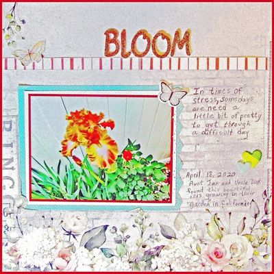
For this layout, I started with 49 & Market's Bold $ Beautiful collection. My aunt and uncle in California posted a photo yesterday of the stunning new color of iris that they found growing among her foliage and other plants. Seeing the range of hues in the flower gave me the idea to use a color-wheel combination of beautiful paper and embellishments.glittered title, BLOOM, above the red and white strip.
I chose a background paper from the collection that had flowers and print along the bottom and sides the paper, but only minimal print across the top. I adhered my photo of the flower to a dark red cardstock, then to a white paper that formed a 1/2 inch frame around thofe photo. Then I added a turquoise frame and punched a small border pattern along the right side. The striped strip about 3 inches from the top is actually the bottom strip cut from another paper. I added a couple of butterfly embellishments and two hearts around the edges of the photos.
FINISH AND POST MID-MAY
First, I took a photograph of this amazing flower. It's a deep orange wth light gold and peachy-pink accents. The primary colors on my color wheel showed that turquoise is a complementary color, so I started by making a frame with turquoise paper and laid it down on my background. I cut around the tiny green flower in the bottom left, then cut slits along the left and bottom. I used a punch to give it some pizzaz on one edge.
Next I cut a piece of dark red cardstock and glued the photo to the mat. Underneath that, I used white cardstock to make a second frame. I adhered the framed photo to the turquoise mat and glued framed photo down as shown.I added a butterfly fussy-cut from my paper, a set of two vinyl hearts and a small white vinyl butterfly.
The striped paper strip along the top edge of the display area is just the coordinated color cut from the bottom of another sheet of cardstock. I added gold glittered title letters and hand-wrote the journaling.